2019 Colors of the Year Channel Warmth, Renewal, and Soul

“Color surrounds us and defines our world,” says Leatrice Eiseman, executive director of the Pantone Color Institute. “From early infancy on, colors in our environment affect us both physiologically and psychologically, affecting our decision-making as well as creating the magic and mood. Considered a universal, yet silent language, the Pantone Color of the Year evokes a mood or feeling that addresses an aspiration or sentiment occurring in the zeitgeist.”
Living Coral is Pantone’s choice for 2019’s color of the year.
“Color is an equalizing lens through which we experience our natural and digital realities and this is particularly true for Living Coral,” says Eiseman. “With consumers craving human interaction and social connection, the humanizing and heartening qualities displayed by the convivial Pantone Living Coral hit a responsive chord.”
Pantone isn’t the only company to share a color of the year. In fact, it’s become somewhat of a sport to watch the various companies share what hue they believe will resonate with customers since the color choices affect everything from home interiors to beauty products. Each year’s color of the year reveal is a bit of a barometer. It’s a reflection of our culture, what we hold important in our lives right now or what we’re seeking.
Perhaps it’s no surprise, then, that Sherwin-Williams chose Cavern Clay as its 2019 Color of the Year. A warm terracotta color with ancient, elemental roots, Cavern Clay is a nod to midcentury modern style, but with the soul of the American Southwest, which together create the desert modern aesthetic, according to the company.
“We believe 2019 will be a renaissance of the 1970s—with a twist. In the coming year, we will embrace our pioneering spirits and artisan ingenuity,” shares Sue Wadden, director of color marketing, Sherwin-Williams. “Our 2019 Color of the Year, Cavern Clay, embodies renewal, simplicity and free-spirited, bohemian flair.”
Also known as SW 7701, Cavern Clay is a part of the Wanderer color journal that was announced earlier this year in Sherwin-Williams 2019 Colormix® Color Forecast. According to Wadden and her team, it makes a perfect choice for residential and commercial settings as the warm and earthy hue is both casual and refined.
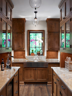
It can be the backdrop of a playful, welcoming dining room or kitchen when paired with bright tiles, warm natural stone and sculptural greenery.
“Cavern Clay is an easy way to bring the warmth of the outdoors in,” Wadden adds. “Envision beaches, canyons and deserts, and sun-washed late summer afternoons—all of this embodied in one color.”
She recommends designers and homeowners pair it with other casual, balanced neutrals such as a warm gray or deep brown.
Benjamin Moore, on the other hand, has named Metropolitan AF-690 its Color of the Year 2019, a stylish gray with cool undertones.
“Comforting, composed and effortlessly sophisticated, Metropolitan AF-690 exudes beauty and balance,” notes Ellen O’Neill, Benjamin Moore’s director of Strategic Design Intelligence. “It’s a color in the neutral spectrum that references a contemplative state of mind and design. Not arresting nor aggressive, this understated yet glamorous gray creates a soothing, impactful common ground.”
Benjamin Moore also announced Color Trends 2019, a curated palette of 15 harmonious hues that further amplify the cultured grace of Metropolitan AF-690 which range from ethereal neutrals to frothy pinks to rich blues and greens.
Adding the Color of the Year into Home Design
When it comes to how homeowners can adopt the colors of the year into their own homes and use natural stone, Josh Levinson, president of wholesale for Artistic Tile, recommends they consider using the colors as inspiration for natural accent colors.
While homeowners can look to color of the year choices for inspiration, Levinson notes that natural stone choices tend to be more timeless and enduring than the trends set forth in the color of the year. “With that said, it is interesting to see the connection between the Pantone Color of the Year Living Coral and tones represented in our newest introductions, SPQR Red Blend and Sail Fete, which combine ancient stone colors in new ways,” he adds. “The life expectancy of a stone installation is long, so clients do not want to choose a color that is a flash in the pan.”
Lauren Coburn IDS, interior designer with Lauren Coburn, LLC, agrees with Levinson. From Pantone to Sherwin-Williams and Benjamin Moore, the colors of the year recommendations are classic colors that feel good to live with, stay timeless, and offer a nice neutral backdrop for creating dynamic focal points as layers.
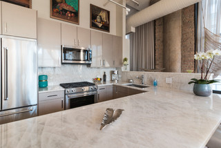
When it comes to natural stone, her clients lean toward quartzite because it’s practical and easy to maintain. “The general trend is still towards anything close to white,” says Coburn, who points that clients prefer softer and lighter colors such as white for countertops.
“Iceberg is the most highly and most costly desired quartzite because it looks like white onyx and has translucency,” she adds, noting that her clients prefer the stone when it is extra-thick with mitered edges.
As Wadden recommends that designers and homeowners consider pairing Cavern Clay balanced neutrals such as a warm gray, Coburn is already noticing her clients moving away from sterile and cool gray tones and opting for those warmer gray (taupe or a gray-beige) looks.
“This keeps with the clean modern feel of gray and white but still keeps the home feeling warm, and it mixes beautifully with accent colors,” she says, using the term “greige” when describing the tone. “Benjamin-Moor’s Metropolitan is an example of this, as it keeps the home feeling warm and mixes beautifully with the right accent colors.”
Her clients also love a blush color similar to Pantone’s Living Coral, but more of a very soft pinky-beige. “It’s beautiful mixed with white, warm grays,” she says, “and I love rose gold metal or white gold metal details with it!”
Color of the Year reveals are always a fun way to welcome the new year and new possibilities to imbue color and inspiration to our homes.


